Design System
Role
UX/UI Designer
Timeline
June 2024 - present
Responsibilities
Creating components, Documentation
Product name
Binder
Context
Binder is a school management web app designed for school staff to manage school assets, monitor availability, submit tickets, oversee both staff and students, and integrate with platforms such as Microsoft 365.
When I joined as the only designer on deck, I had a huge task as there was no established design language or UI kit. With a clear disconnect between existing designs and actual code, plus a strong need for product scalability, I took on the challenge of building a design system from scratch.
PROBLEM
No design language or UI Kit in place
When I joined, there was no design language or UI kit in place. Engineers relied on an open-source library and hard-coded elements from basic BA wireframes, leading to inconsistent designs across the app. Because both in-house and freelance teams were working on different features simultaneously, these inconsistencies piled up in the code, dragging out the UI testing phase and delaying launches.
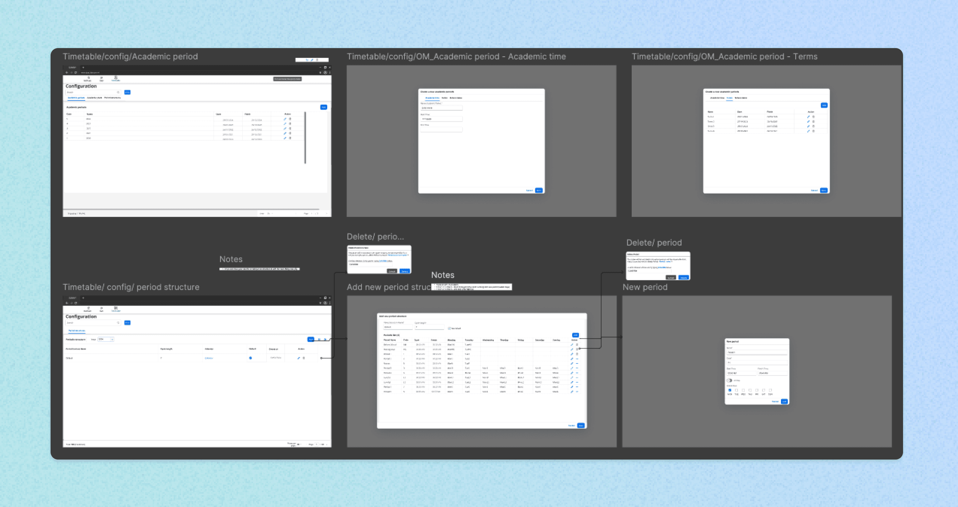
The initial process included BA drawing wireframes and sending them straight to dev without UX/UI consultation
PROJECT GOALS
For the Product & Team
Establish a single source of truth to align design and development efforts, improve efficiency, and ensure scalability
Ensure the system is easily understood, maintainable, and scalable. Most importantly, it needs to be simple to adopt for all teams
Minimise repetitive design decisions and reduce QA issues stemming from UI inconsistencies
For Users
Deliver a cohesive and accessible interface that reinforces Binder’s brand
Improve usability through consistent design patterns and interactions
Boost user confidence in the platform’s reliability and professionalism
Understand the problem
Too many variants!
The first thing I did was conduct a quick audit. I discovered the common problem was that there were too many variants of each component. This was caused by a lack of a proper design system with up-to-date documentation and the inconsistent assets that developers chose to implement. At the time, the developer chose an open-source UI kit with limited customisation ability to save time in the development process.
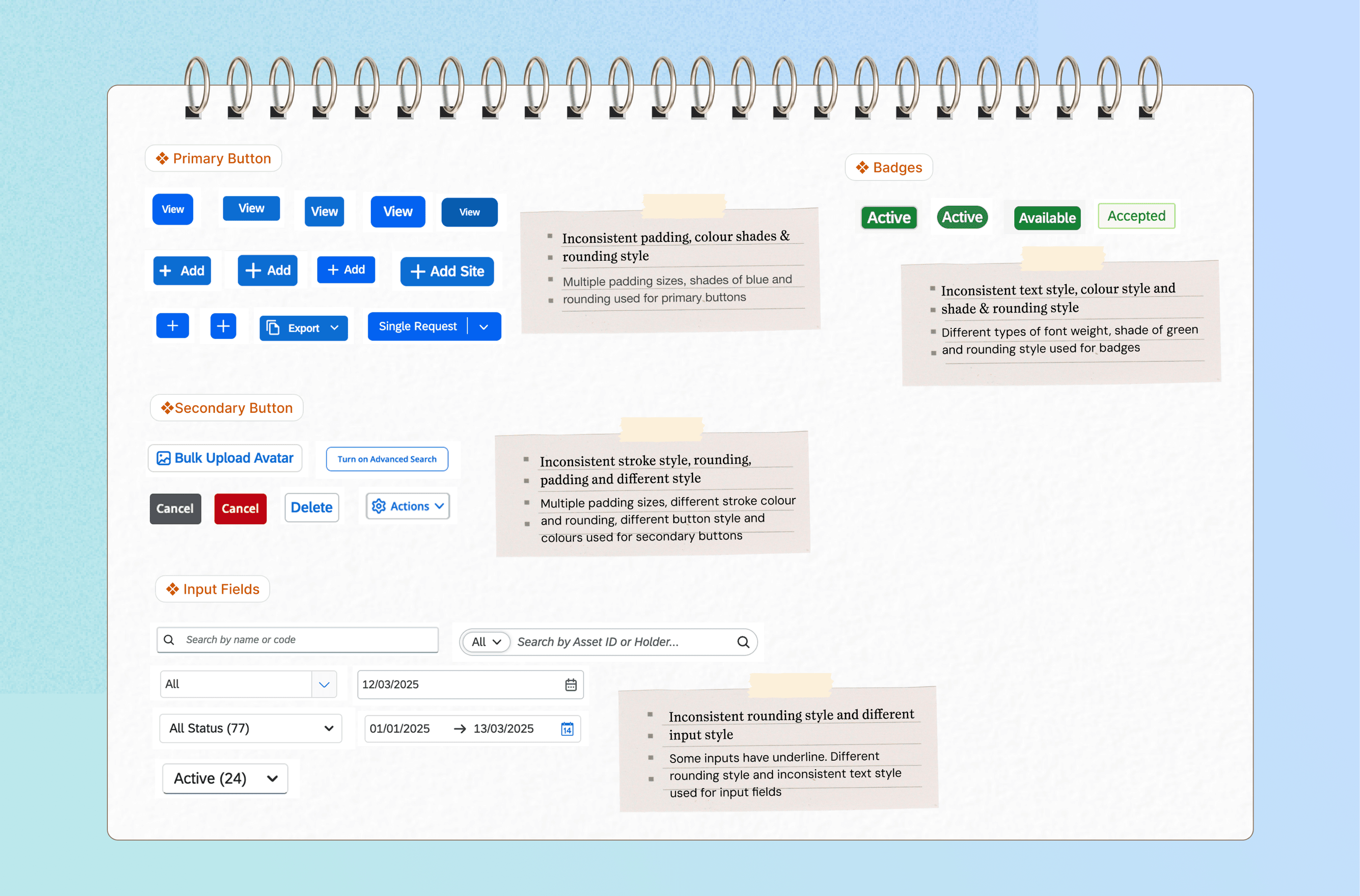
pain points
Our approach
Prioritising core components
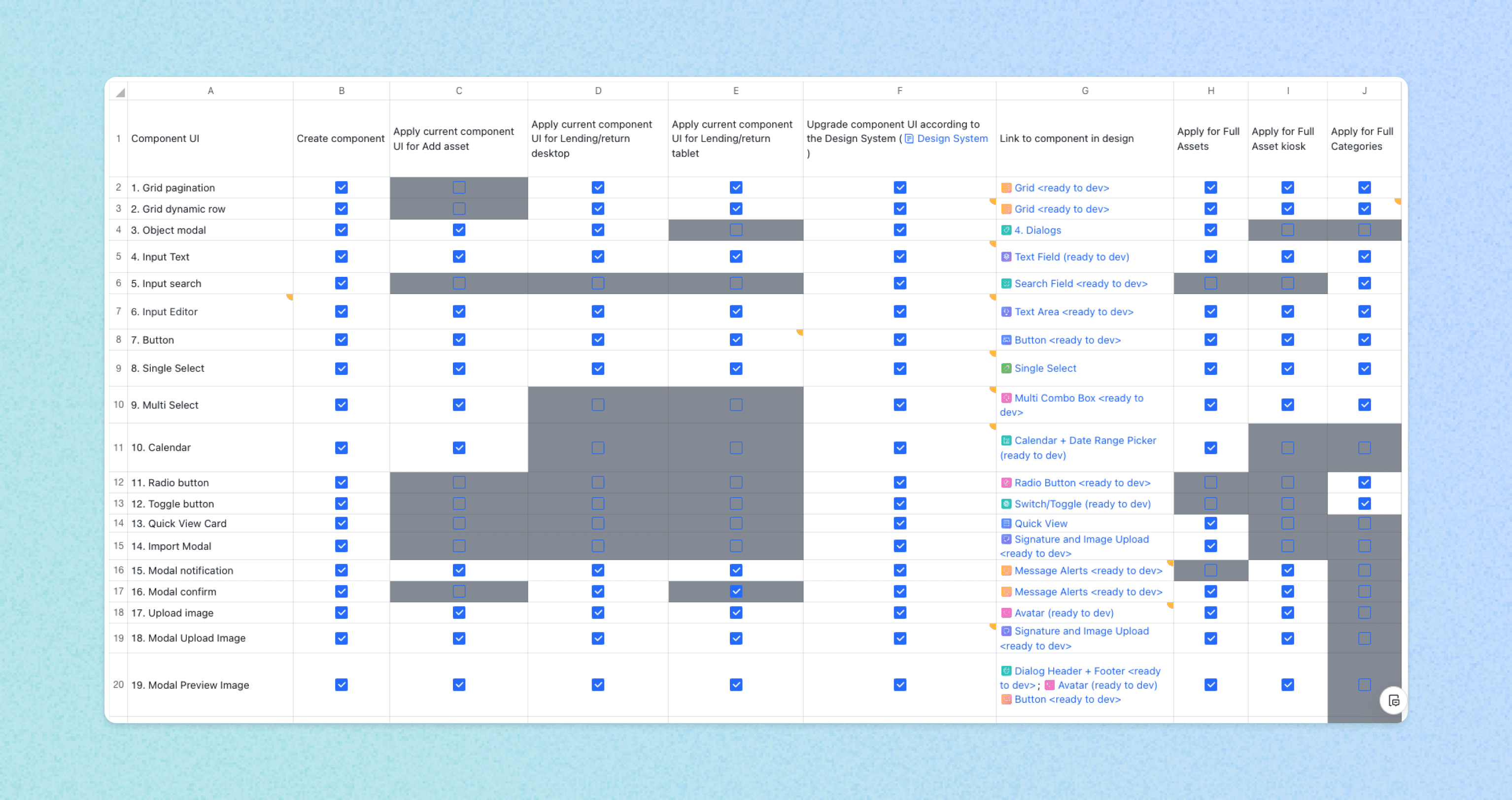
Due to time constraints, I focused on the most frequently used and high-impact components first, like text fields and buttons. Throughout this process, I worked closely with the development team to identify common components and discuss implementation details. We then created a table to map out all the components we needed at the time. This helps us visualise the prioritisation of resources and the expected timeframe to make sure the library implementation aligns with the product roadmap.
Establishing a design system foundation
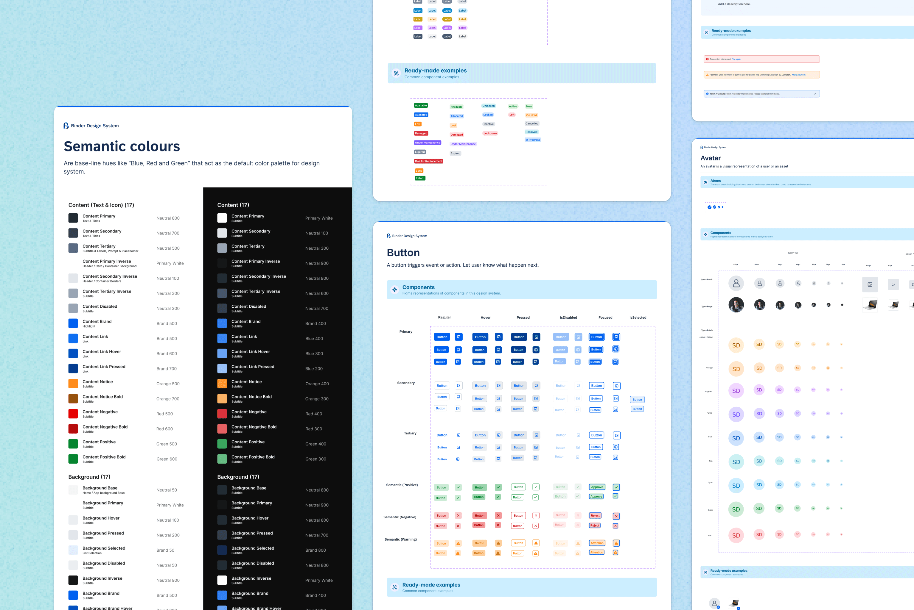
I began by establishing a consistent brand style, choosing a cohesive color palette, and a clear type scale to create a unified experience. For easier implementation, I also introduced a straightforward naming convention—using descriptive prefixes and suffixes (e.g., text-primary, “background-secondary”)—to keep text styles, states, and background layers well-organised.
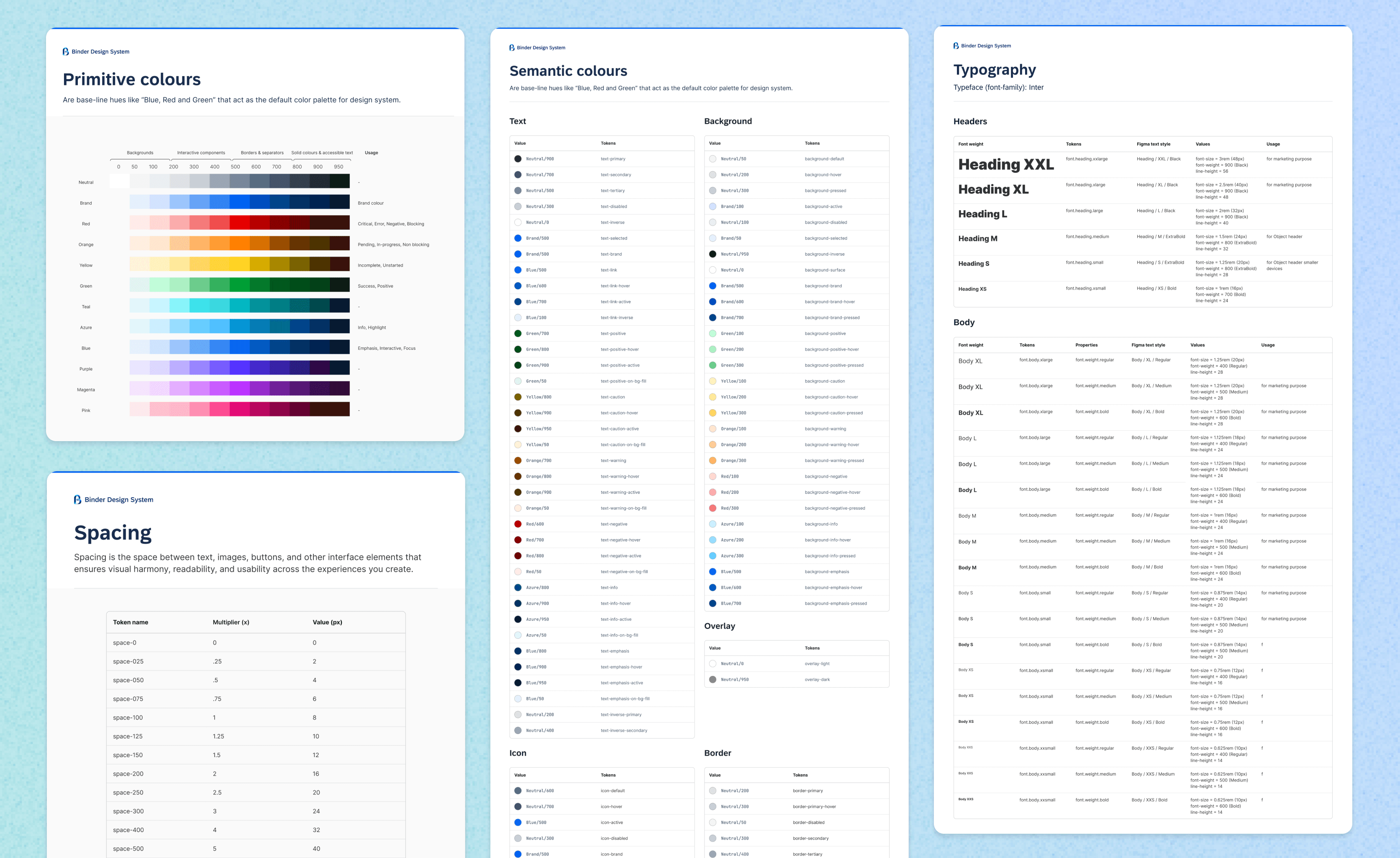
My foundations include the style, effects, and structure that are used in the creation of components within the design system. It includes colours, typography, spacing, border, and shadows.
Incorporating the Atomic Design principle to create a shared design language
This was my first time building a design system, and applying the Atomic Design principle was very helpful to me. We started with atom-level components, then assembled them into molecules, organisms, and finally templates. This structure gave us a more organised library with reusable components, ultimately improving consistency, efficiency, and scalability.
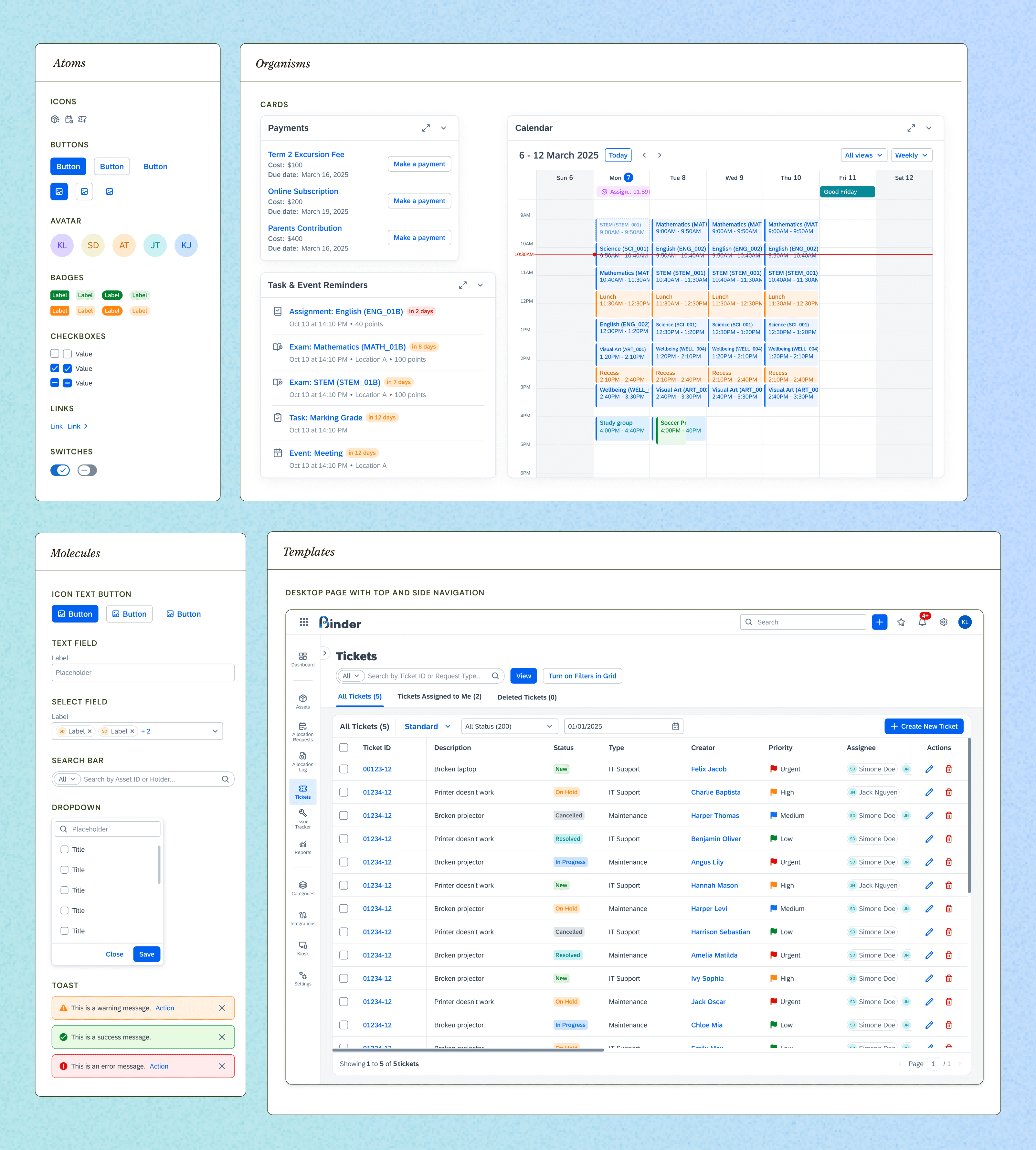
A quick peek at how I organised the components using the Atomic Design principle
Elevating collaboration through best practices
While creating our design system, I made sure to follow key design principles that streamlined both design and development.
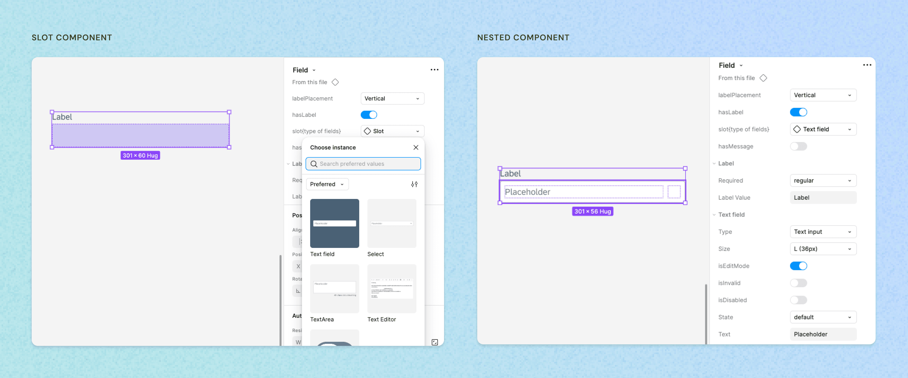
I used a consistent naming convention for component properties to reduce cognitive load when searching for the right elements, grouped related variants and properties to keep the interface organised, and nested instances for complex components to maintain clarity. I also adopted slot components to avoid detaching elements, preserving the overall structure while allowing flexibility for different design contexts. Each component also has its documentation, including all variants, states, and other dimensions, followed by usage guidelines for easier implementation.
Additionally, introducing Dev Mode in Figma helped developers pull accurate specs directly from the designs, boosting efficiency and reducing back-and-forth debugging.
Outcomes & IMPACTs
So… did it work?
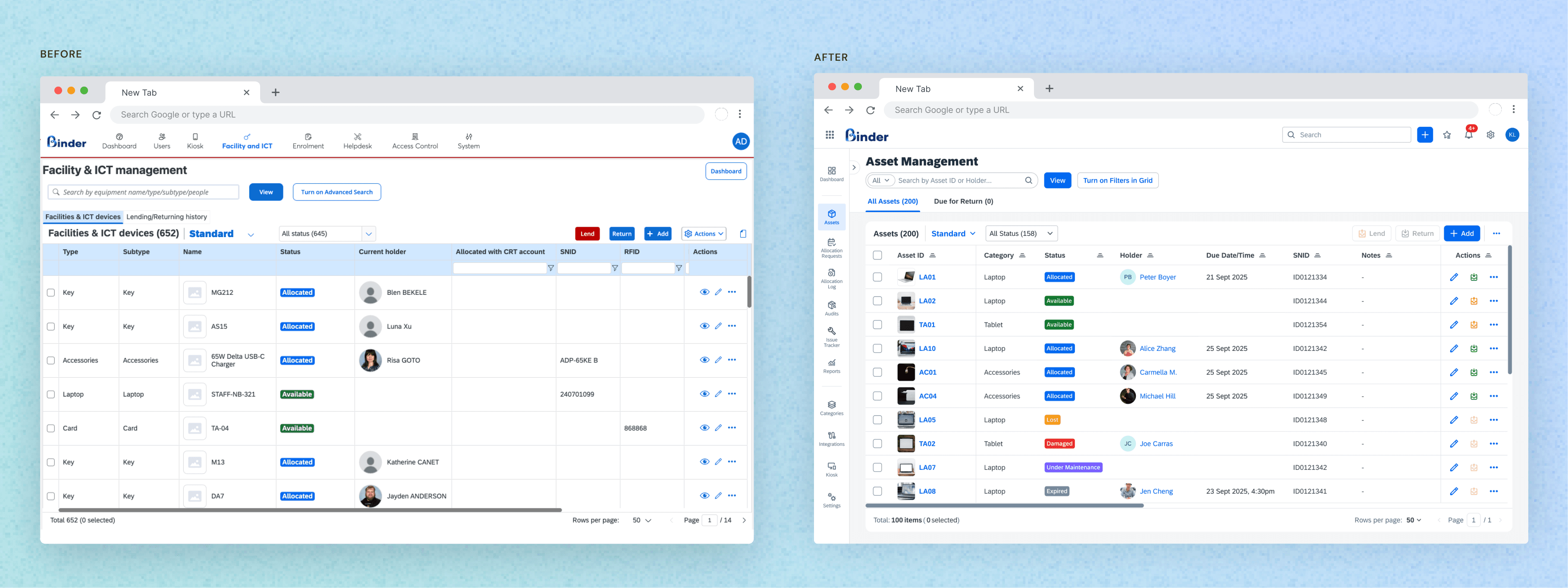
The before and after applying the design system to one feature.
The design system is a continuous work-in-progress, but even in its current form, it has already streamlined how designers and developers collaborate. To see if it meets the goals we initially set, let’s break it down:
Understandable: using the Atomic Design framework makes it straightforward for both designers and developers to understand how components are built. We now rely on a single, dedicated Binder library, preventing confusion and ensuring everyone references the same guidelines. This clarity also makes onboarding new team members a breeze.
Scalable: by organising components into reusable building blocks, we can quickly expand the library to support new features, pages, and entire product lines without starting from scratch.
Maintainable: consistent naming conventions and usage best practices mean any changes made at the atomic level automatically roll out across the system. Everything is documented under a single set of guidelines, keeping maintenance simple.
Simple to adopt: our design system is fully integrated into our Figma workflows, giving both new and experienced team members immediate access. The step-by-step documentation lowers the learning curve and ensures smooth adoption.
Efficiency: standardised elements significantly cut down the back-and-forth during QA, letting the team focus on building new features instead of fixing UI issues. Designers and developers stay aligned by sharing updates in Figma and chat tools, accelerating feedback loops.
By centralising all design decisions into one single source of truth, the final UI remains visually and functionally coherent across different platforms and features, minimising rework and confusion.
In short, while there’s always room for refinement, the system already delivers on its promise: it helps teams work more efficiently, ensures consistency, and makes ongoing iteration much smoother.
REFLECTIONS
Challenges & Lessons
Dev Involvement from Day One: Integrating developer feedback into the earliest design phases would have prevented the initial adoption issues.
Continuous Communication: Regular check-ins and design critiques proved essential in keeping everyone aligned.
Documentation Maintenance: A design system is never “finished.” Keeping documentation current is crucial to ongoing success.
Next Plan
Storybook Integration: Request the implementation of Storybook for a robust master component library that developers can reference in real time.
Improved Onboarding: Create quick-start guides or mini-tutorials to get new team members up to speed on the design system.
Ongoing Feedback Loop: Regularly survey developers and stakeholders to refine components and guidelines.